Creating a resume design is always a tedious task, and getting started is always more complicated. The design of a resume should reflect your personality and your potential. The content is important, but so is the style.
Where to start to create a quality design CV? How to create it without using complex tools like Photoshop or Indesign? What are the small details that will make all the difference?
Here are the keys to creating a designer CV easily , with examples of designer CVs to inspire you.
A good resume design starts with a clear and neat header.
The header immediately catches the eye, it structures your CV design and must highlight a short introduction to your profile. It will therefore immediately set the tone for your profile. A clear and concise title will impose your identity and determination on your CV Design . You will show what you are looking for and present yourself in the form of a short presentation. This is the best way to give a short view of your added value to the recruiter. At a glance, he will know who he is dealing with.
🚀 To learn more, read our article on how to write a catchy sentence for your CV .
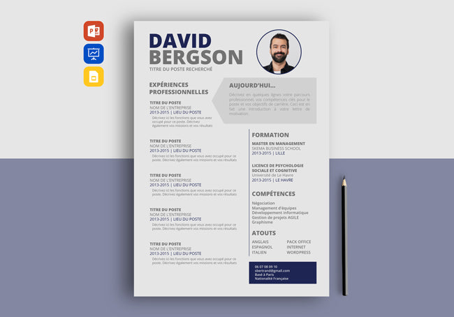
We advise you to give some style to your header. This is typically the section of your CV that can benefit the most from it. If you are afraid that your CV design is too stylish, the header can provide a graphic design that will compensate with the rest of the CV more classic and smooth. For example, you can play with a more original typography and cartridge like in our BEGINNER CV .
The photo is also a good opportunity to give a creative touch in the design of a CV . You can play on the shape - geometric, round or square - and on its size.
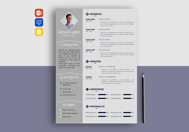
The THEMATIC CV template offers a fairly classic design but the diamond-shaped photo immediately gives it a more creative touch.
Your photo should reflect a positive image of you, and give the recruiter the feeling of having met you before. Avoid excesses such as selfies, black and white, lost gaze, too old or wedding photos. Favor a neutral background and stay natural, your CV design will be much more welcoming, honest and authentic. If you are hesitant to include a CV photo, check out our article on CVs with or without a photo .
We also advise you, if you have the opportunity, to have yourself photographed by a professional. This shows your seriousness and will increase your confidence.
💡 Good to know
Save long hours of work with a professional resume template ready to fill in within minutes. Many examples of designer resumes to download are available to save you time.
Graphic elements: icons, graphics, etc.
Graphic elements like icons add a modern and more contemporary touch to your resume design . If used wisely, they can break up the monotony of reading and allow you to highlight more essential elements.
They can also be useful to make certain information easier to read. For example, you can use the logos of the companies you have worked for, or use an icon to illustrate the sections of your CV . This way, the scan is more efficient for the recruiter.
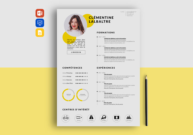
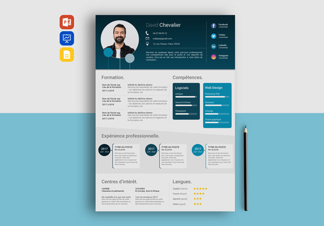
The assessment of your skills (“hard skills” or “soft skills”) can also benefit from interesting graphic elements. Infographics, for example, are very useful for visualizing your level of personal or professional achievement. The perception of the tools mastered or the mastery of a language seem much more intuitive to the recruiter with a value scale.
Your hobbies can also be very interesting to visualize in infographics, especially if you have a particular gift or have reached a quantifiable point. Are you a chess champion? Are you good at classical dance or playing the piano? Take advantage of it! It will be much more interesting for the recruiter to have a graphic view rather than citing your diplomas that he does not know or your ELO ranking...
Interests are a great way to stand out from other candidates. They add color to your profile and demonstrate your determination and personality. Who you are in real life says a lot about who you will be in the company. If you are struggling to highlight your interests, check out our article dedicated to the hobbies section .
There are several chart options available to you to visualize your skills and interests: pie chart, bar chart, rating scale, graph, etc.
The design touch through the CV background
Another tip to transform your too bland CV design into a designer CV is the superposition of background images . This breaks the classicism of the CV and creates a framing and depth effect. Your Curriculum Vitae is immediately highlighted.
To do this, you can simply place your already created CV on a personalized background according to your wishes: travel, inspiration, theme of the sector in which you wish to apply... It's a very simple tip but it completely changes the appearance of your Curriculum Vitae!
In the example of the CV with drawing , you can see that the background counts for 98% of the style of the CV. The advantage is to be able to customize it according to the sector, the position or the company in which you are applying.
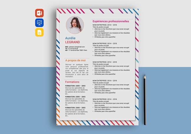
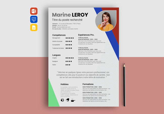
Another more creative example is the use of colored patterns: dots, lines, rays... In the example of the COLORI CV (below), the big advantage is to capture attention right away. Be careful though because this approach will not be suitable for all sectors. To be preferred for the cultural, creative or academic environment.
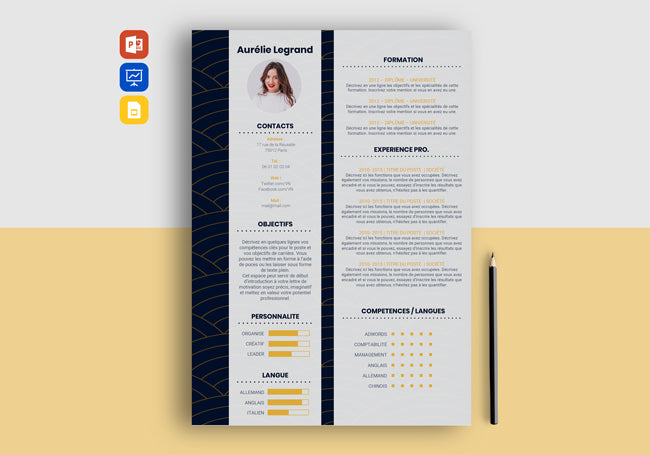
A final technique for using the CV with background is the succession of patterns and contents. By using strong contrasts such as black/white, red/yellow or blue/cream for example, your CV will be visible in the foreground with a significant graphic touch in the background.
The example of a COLUMN CV is a good illustration of this contrast effect. Observe the midnight blue Japanese patterns that make the candidate's content stand out.
Style your profile picture
If you have a very professional photo , don't hesitate to put it forward! The photo has the ability to make your CV more authentic. We simply have the feeling of knowing you better, and having more confidence. Be careful, however, not to appear too sure of yourself , this risks giving the opposite feeling.
Here are some examples of Design CVs with a photographic or very graphic background which immediately gives a creative and design aspect to the basic model...
If you have a passion for travel or photography, you can also take the opportunity to use one of your personal photos to illustrate the header of your CV. This tip is very practical for communicating your interests .
A template and a graphic layout
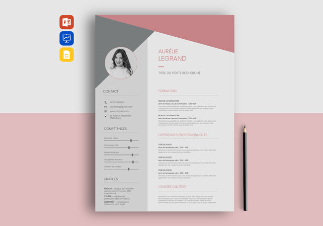
The rule of elegance is simplicity combined with small touches of “twist”. In this sense, simple or “minimalist” CV models allow you to appreciate the fact of going to the essentials with an easy and direct reading. Both classic and contemporary, the minimalist design announces a modern candidate who knows how to gauge the balance between fantasy and efficiency.
The general template of your CV Design can be reworked to provide a certain dynamism without disrupting the content.
To do this, don't hesitate to bet on bright contrasts, for example with a neutral background and a colorful font in places. Conversely, a colorful background with neutral typography also works very well:
If you work in an artistic sector such as Designer , Illustrator or Art Director for example, you can afford to use a template that clearly breaks with the classic codes. Recruiters are more used to receiving a “book” of your work. Your CV design can therefore, even if it must be formal, highlight your creativity. For example, you can play on typos, gradients or a more graphic layout.
If you are a recent graduate or looking for an internship , the template and layout can help you reduce the blanks in your career path or visually reduce the lack of skills. “Form allows you to highlight the substance” as they say.
Indeed, a successful modern CV will give the first proof of your perfectionism and your investment in the company to which you are applying.
In the Design CV examples above, the airy lines combined with the colors offer a certain freshness and seriousness. Ideal for candidates who have just left school.
For more tips on creating a resume with little experience , read our article on how to make a resume as a student with no experience or how to make a resume for an internship .
A font duo that is both readable and stylish
The font (or typography) quickly reflects your personality, your temperament or your rigor. There is a very wide variety of typographies, it becomes very complicated to choose them. To tell the truth, there is no perfect font, let yourself be free to choose it. On the other hand, some rules are essential for the design of CV ...
The first rule is to use a clearly readable typography. There is nothing more frustrating for a recruiter than having to make the effort to read you. If you prefer original typography, prefer to use it for the title of your CV: LAST NAME, First name - Position and/or sought.
As for the headings, it is best to keep the same typography as for the CV title to maintain a certain consistency. Indeed, if you accumulate too many typographies, same thing, this will require the recruiter to make an additional reading effort.
As for the content of the sections (missions, skills, etc.), keep a classic typography, very easy to read like ARIAL, CALIBRI or HELVETICA. Once again, prioritize the comfort of the person who will read you. This will be a first advantage that you will have over other candidates.
To learn more about choosing a font, read our article on which font to use for a CV .


